

Description
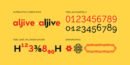
Geometric forcefulness in your hands, inspired by the aesthetics of the thirties, on the labels of the most famous spanish beer, Moriz. A tribute to success and purity of form.
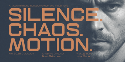
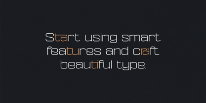
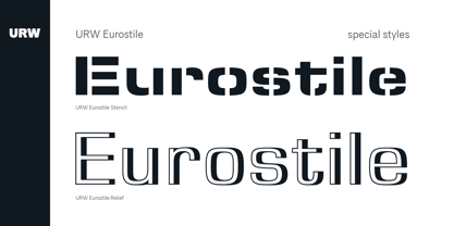
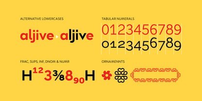
Although its design is based on the idea of its main use in running text, hence the familiarity of its shapes and the generosity of its eye, which offers absolute legibility, we have given you the option of customizing your headlines by incorporating a large number of stylistic alternatives for the capital letters and for some of the lowercase letters. And as usual in this house, a complete set of small caps.
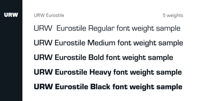
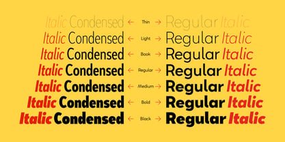
You will be able to play with its two axes, width and weight, to adapt to complex hierarchies in varied line widths and needs of arracades and highlights.